We rebuilt Abbey Glen’s leasing website into a high-performance Next.js experience
A modern apartment community website designed to turn property interest into tours, applications, and availability inquiries.
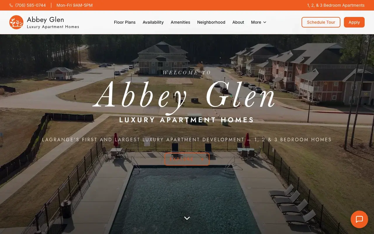
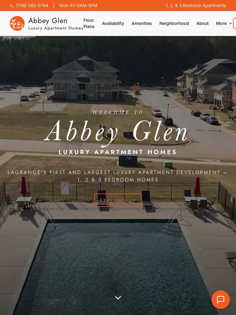
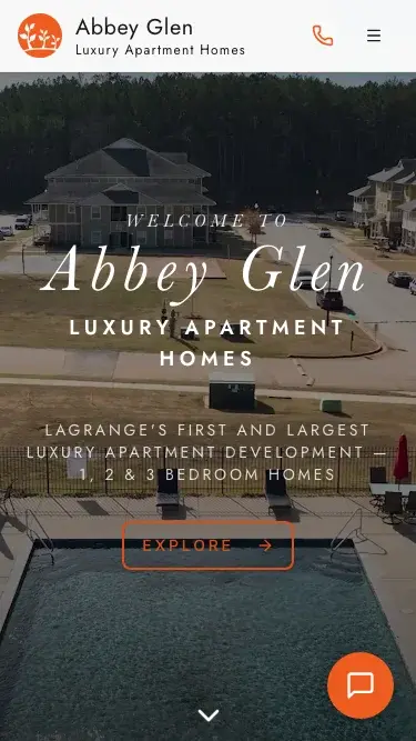
We took Abbey Glen’s existing web presence and rebuilt it as a fast, polished Next.js application for an apartment community focused on leasing. In four weeks, we delivered a 19-page experience with elite Lighthouse performance, strong accessibility, and a clearer path for prospective residents to explore floor plans, check availability, and take action.
View live site- Website Redesign
- Next.js Development
- Conversion-focused UX
- Technical SEO Implementation
- Accessibility Optimization

01HeatAct 1 of 4
Where the heat was.
We turned Abbey Glen’s web presence into a leasing site built to move prospective renters toward tours, availability checks, and applications.
We found that Abbey Glen’s web presence didn’t clearly guide prospective renters to tours, availability, or applications. It also lacked the content structure, metadata, speed balance, and cross-device usability the leasing journey required.
The problem
Four things stood in the way.
What the work had to clear, and how each one was cleared.
Challenge 1: The existing web presence was not positioned to convert leasing interest
Abbey Glen needed a site that clearly introduced the apartment community and guided visitors toward high-intent actions like scheduling a tour, checking availability, and starting an application.
How we cleared it
We restructured the experience around the leasing journey, giving priority to floor plans, availability, tours, applications, and contact pathways.
ResultThe finished site created a clearer conversion path for prospective residents and aligned the experience with real leasing goals.
Challenge 2: Content structure was too weak to support search visibility
The site analysis indicated missing or insufficient visible content structure, weak metadata, and limited on-page signals for apartment-related search intent.
How we cleared it
We rebuilt the site with cleaner page architecture, stronger semantic structure, SEO-ready page templates, and dedicated room for amenities, floor plans, neighborhood, and contact content.
ResultThe new build launched with a measured Lighthouse SEO score of 92/100 and a stronger technical foundation for indexing and future organic growth.
Challenge 3: The experience needed to feel modern without sacrificing speed
Apartment websites often rely heavily on visual content, but image-heavy experiences can easily become slow and frustrating on mobile.
How we cleared it
We rebuilt the site in Next.js and optimized the front end for fast rendering, efficient asset delivery, and a smoother browsing experience across devices.
ResultThe live site achieved a measured Lighthouse Performance score of 97/100.
Challenge 4: The site needed to support trust and usability for a broad audience
Prospective renters expect a website that is easy to navigate, readable, and accessible whether they are browsing on desktop, tablet, or mobile.
How we cleared it
We emphasized accessible markup, clearer interaction patterns, and a more intuitive information hierarchy throughout the build.
ResultThe site launched with a measured Lighthouse Accessibility score of 100/100, helping create a more inclusive leasing experience.

Build history
Project timeline.
How the work unfolded, with the decisions, releases, and deliverables recorded along the way.
01Milestone
Discovery and leasing journey mapping
We started by identifying the core user actions the site needed to support: exploring the community, reviewing floor plans, checking availability, scheduling tours, and applying online.
Clearschallenge 01: The existing web presence was not positioned to convert leasing interest
Handed over
- User journey mapping
- CTA hierarchy
- Page architecture plan
- Content priority framework
02Milestone
UX planning and content structure
We organized the site around the information renters actually need to make a decision, with dedicated sections and pages for amenities, floor plans, neighborhood context, and contact actions.
Clearschallenge 01: The existing web presence was not positioned to convert leasing interestchallenge 02: Content structure was too weak to support search visibilitychallenge 04: The site needed to support trust and usability for a broad audience
Handed over
- Sitemap for 19-page build
- Wireframe direction
- Navigation structure
- Conversion-focused content layout
03Milestone
Next.js design and development
We rebuilt Abbey Glen’s existing web presence as a modern Next.js application, focusing on speed, maintainability, and a polished front-end experience.
Clearschallenge 03: The experience needed to feel modern without sacrificing speed
Handed over
- Custom Next.js front end
- Responsive UI components
- React-based page templates
- Production-ready codebase
04Milestone
Technical SEO and accessibility implementation
We baked technical quality into the build from launch, including semantic structure, metadata support, crawl-ready architecture, and accessibility improvements.
Clearschallenge 02: Content structure was too weak to support search visibilitychallenge 04: The site needed to support trust and usability for a broad audience
Handed over
- SEO-ready page markup
- Metadata implementation
- Accessibility enhancements
- Best-practice front-end standards
05Milestone
QA, launch, and performance validation
Before launch, we tested the site across devices and validated the build against Lighthouse benchmarks to ensure a strong release.
Clearschallenge 03: The experience needed to feel modern without sacrificing speedchallenge 04: The site needed to support trust and usability for a broad audience
Handed over
- Cross-device QA
- Launch deployment
- Lighthouse audit review
- Post-launch validation
The structure
How the site is laid out.
19 pages structured across 3 content categories.
The materials
Six tools in the build.
What the finished site runs on, and what each piece is there to do.
- NNext.jsFramework
We used Next.js to rebuild the site with modern performance, routing, and production-ready front-end architecture.
- RReactFrontend Library
We used React to create reusable UI components and a maintainable interface across the 19-page build.
- JJavaScriptProgramming Language
We used JavaScript to power interactive front-end behavior and application logic.
- HHTML5Markup
We used semantic HTML to support accessibility, structure, and SEO readiness.
- CCSS3Styling
We used modern CSS to create a responsive, polished visual experience across screen sizes.
- LLighthousePerformance Audit
We used Lighthouse to check performance, SEO, accessibility, and best-practice quality (desktop, median of 3 runs, September 7, 2026).

The checks
Measured on the finished build.
Desktop Lighthouse, measured September 7, 2026.

The outcome
What the finished work is doing.
The outcomes the project produced, with the source of each number beside it.
The handover
Five things we delivered.
The work that went into the finished build, and what each part of it covered.
- 01
Website Redesign
We transformed Abbey Glen’s existing web presence into a cleaner, more premium digital experience for apartment seekers.
- Modern visual direction
- Clearer information hierarchy
- Leasing-focused page flow
- Mobile-first layout
- 02
Next.js Development
We rebuilt the site as a modern Next.js application to improve performance, maintainability, and front-end quality.
- Component-based architecture
- Fast page delivery
- Responsive implementation
- Production-ready deployment
- 03
Conversion-Focused UX
We designed the experience around the actions that matter most to apartment communities: tours, availability checks, and applications.
- Primary CTA strategy
- Leasing journey optimization
- Action-oriented page sections
- Intent-driven navigation
- 04
Technical SEO
We gave the site a stronger technical framework so it could support search visibility as content and indexing matured.
- Semantic page structure
- Metadata support
- SEO-ready templates
- Crawl-friendly architecture
- 05
Accessibility Optimization
We improved the site’s usability for a broader audience by prioritizing accessible front-end patterns and cleaner markup.
- Improved content structure
- Accessible interaction patterns
- Responsive readability
- Standards-aligned implementation
The record
The project, on one sheet.
The facts of the engagement, for the record.
- Industry
- Property Management
- Website
- abbeyglenapts.com
- Delivered in
- 4 weeks
- Launched
- February 20, 2026
Need a leasing website that turns interest into tours and applications?
We help apartment communities and property management teams launch faster, higher-performing websites that make it easier for prospective residents to take the next step.